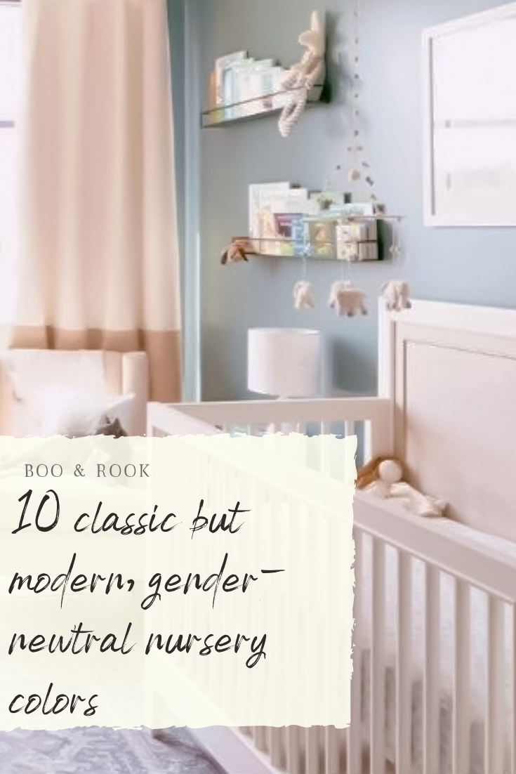
10 Classic But Modern Gender-Neutral Nursery Colors

Nurseries are one of my absolute favorite rooms to design (hence my focus on children's interiors) and paint colors are usually one of the first things that I decide on. My designs always involve classic elements with a modern edge so they will always be in style but are relevant to today's trends. So the following paint colors follow that same logic. These are classic colors that will be able to grow with your child and their room as their style changes. And all of them are gender neutral too, so bonus! (y'all know I love me some pink, so if you want recommendations on the perfect girly shade, stay tuned for that post).
Timeless White (HGSW4055, Sherwin Williams)
The perfect balance of clean, fresh and warmth. It's not too bright but also not to yellow. Just like a breath of fresh air. This is one of my absolute favorite colors and I use it all the time.
(Boo & Rook)
Greek Villa (SW7551, Sherwin Williams)
This color is similar to Timeless White, but is slightly brighter while still being creamy and fresh. Definitely a no fail color and is so versatile. Works great on walls, furniture and trim!
Pale Oak (OC-20, Benjamin Moore)
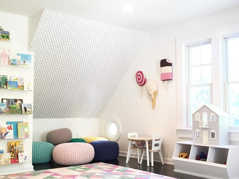
Pale Oak is 2 steps above a white. It's such a classic color and offers a light cozy feel, think light blanket on a cool summer night. If your looking for a neutral that will work with any accent color, will bring in some warmth but still be light and airy, all while adding a light contrast between walls and trim - then this is your color.
Classic Gray (OC-23, Benjamin Moore)
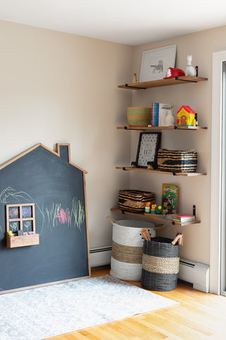
It's all in the name, classic. If you want gray for your nursery, you absolutely cannot go wrong with this shade. It compliments so many colors and can absolutely work with either boys or girls
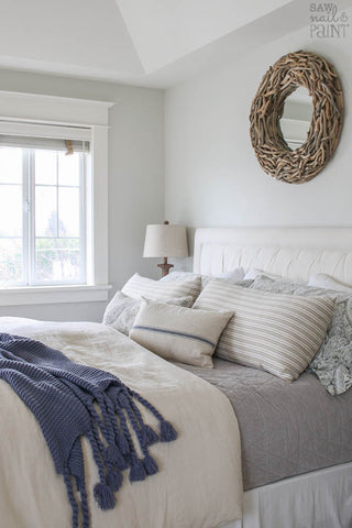
Now we start getting into some colors! All of these are gender neutral and can be considered a neutral color. What?! Just like in fashion, some colors can be considered a neutral.
Slate Tile (SW7624, Sherwin Williams)
This color is a blue-grey that is cozy and just envelopes a space, in the best way possible. It's subtle, feels like home, and can be dressed up or down. Use it on all walls or as an accent and pair it with soft colors and textures and you cannot go wrong.

Archipelago (HGSW3311, Sherwin Williams)
This is one of my favorite colors and can absolutely be used in both a boy or girl nursery - just ask my daughter. This color is such a true navy blue, deep and saturated but with a tinge of brightness to it. I am normally very good at picking out colors and rarely ever second guess my decision - except for my daughter's nursery. I tried about 15 (no lie) color samples, all light and airy, and nothing felt right. Then I told found this color, brought home a sample, showed my husband and he thought I was absolutely crazy. But it turned out amazing and 4 years later I am still in love with this color. And more importantly, my baby girl loves it too.
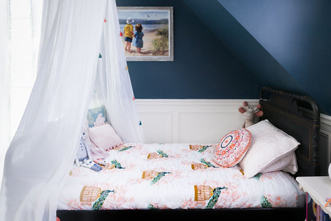
Peppercorn (SW 7674, Sherwin Williams)
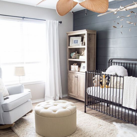
At first glance you may feel that this color is more geared towards a baby boy. But I promise you, if you added white, gold and brought in some coral, this color can totally work for a girl too! This grey has a lot of depth to it and is a beautiful charcoal grey color.
Healing Aloe (1562, Benjamin Moore)
This is popular color for B.M. and for good reason. It's light and airy but adds just enough interest and color to your space. It's almost like its always the best supporting actress - when you walk into the room, you'll notice the design and how you feel in the space, and then realize a large part is this wall color.

Sweet Mint (5005-5B, Valspar)
This color takes Healing Aloe and adds just a little punch to the color. It's the perfect minty shade and pairs well with both feminine and masculine color combinations (ie. pink or navy blue). It's just so...... sweet.

Riverway (HGSW3302, Sherwin Williams)
I came upon this color while working on a gender neutral nursery for an amazing client (see it here) and the one request was an accent wall, but nothing super dark (below was her inspiration photo). I found this color and immediately knew it was the perfect shade of green - calming, chic and neutral. After seeing it on the wall, it has become one of my favorite colors. It's also worth noting that we did an ombre wall effect by painting each wall a different color leading up to Riverway - the other colors (equally beautiful) were Skyhouse HGSW3297 and Rice Terrace HGSW3296.
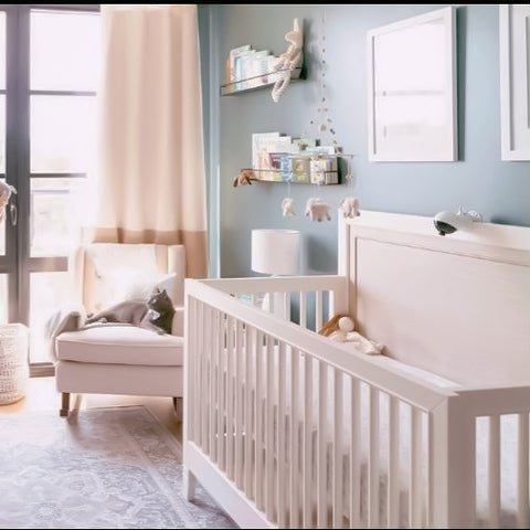
(Boo & Rook)
My client's inspiration, so you have a reference point:
I hope this was helpful to you all and you found some inspiration!
with grace & gumption,
Corinne
Products
View all