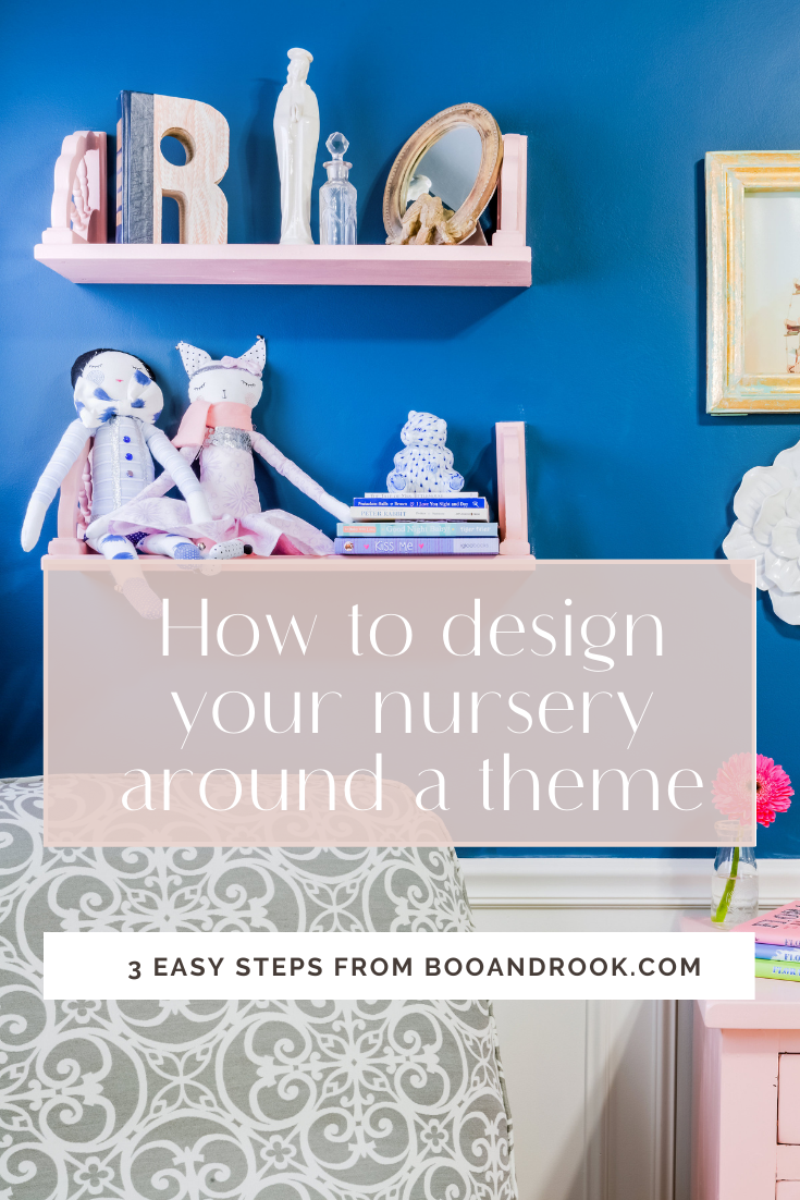
How to design your nursery around a theme

I remember this being one of the first questions my friends asked me when I was getting ready to design my first born's nursery. My initial reaction was, "What? I have to have a theme?!" For those of us that are design conscious but have trouble pulling rooms together, this can add on an extra layer of panic. But don't worry, I have your back and we'll navigate through this together. The most important thing to first understand is that you cannot think of themes in the traditional sense, as in when our parents were decorating nurseries for us.
Themes today are not like they used to be. In past times, a theme would mean picking bears, trains, butterflies etc and plastering those all over the wall with matching sheets, blankets, curtains, lamp shade etc - basically a nursery in a bag. That is not what we are talking about here. In today's design world,
A theme is an idea or collection of design queues that provide you visual guidance and direction. It helps set your design path so you become more focused when picking pieces and it becomes easier to make those decisions.
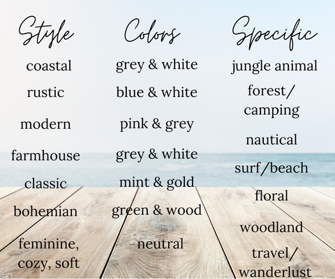
To help you get started, think of your theme in three categories: design style, color, specific. By filling in each category (or at least two of the three), you're ensuring that your theme, and final design, will be balanced and your nursery will have character, movement and personality. Another benefit, is it allows room for simple changes a few years down the road as your child grows and becomes ready for their big kid room. For example, if your theme, is mid-century modern (style) with green, white and black (colors) and animals (specific), when your baby is ready for the transition to a big kids room, you can easily switch out the animals for superheroes.
Below we are breaking down the three categories a little more and providing examples of nursery themes to help you further understand how to make themes work for you as you start designing.
STYLE - this can consist of design styles or small combinations of words that evoke a vibe or feeling
COLORS - choose a main color or a combination of colors to spread throughout the room. Feel free to also use wood tones in this category.
SPECIFIC - this is where you pick 1-2 ideas that are like the sprinkles on top of a cake and add the personality to your space. These are also the items that will be easiest to change out down the road, should you choose to.
Below are some examples of each category to get you started.
And now, let's look through some examples of rooms with themes. I have included nurseries and children's rooms so you can see how you can design both.
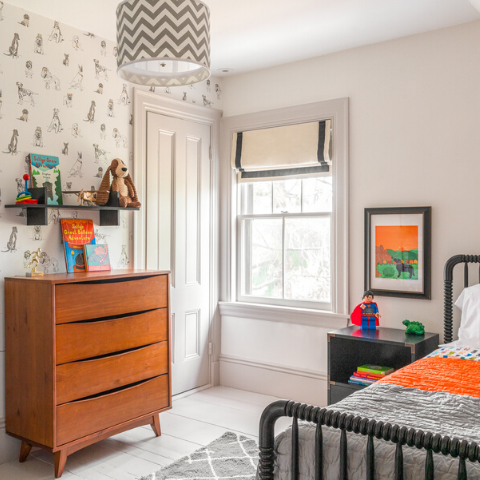
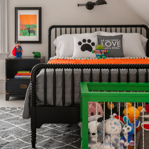
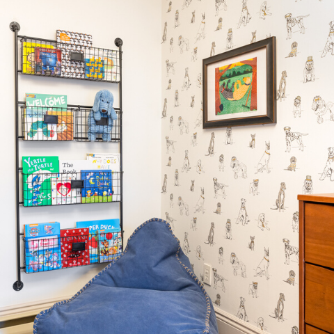
1. A Dog Theme Big Boy Room
My little client absolutely LOVED his dog, Blue, and the homeowners already had these amazing framed prints. So we decided to go with a dog theme for the room. Notice how the dogs are limited to the wallpaper and artwork - everything else is neutral and classic so the room can grow with him and the dogs stand out and look more intentional.
Style: classic, modern
Colors: neutral (white, grey, black) and then we pulled green, orange and blue from the paintings for accent colors
Specific: dogs
Design by: Boo & Rook
2. Superhero Room
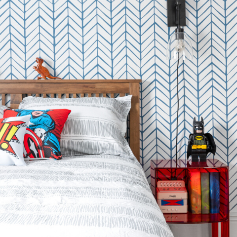
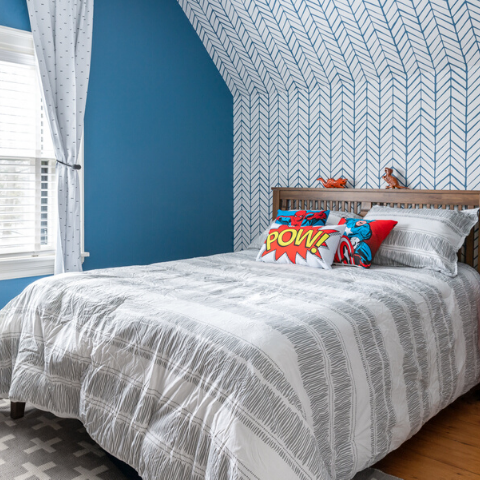
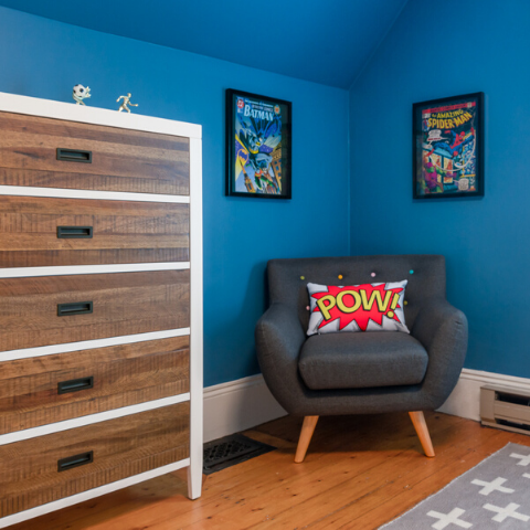
My client was just about in double digits and was a huge fan of comic books. For this space we decided to do a superhero theme. Again, you will notice that the superheros are limited to the artwork and a few decor pieces, but the theme is further enforced with the color theme. The rest of the furniture is clean, simple, neutral tones and will easily transition with him through any other styles, themes and years to come.
Style: modern
Colors: red, white, blue
Specific: superhero
Design by: Boo & Rook
3. Blue is for Girls Nursery
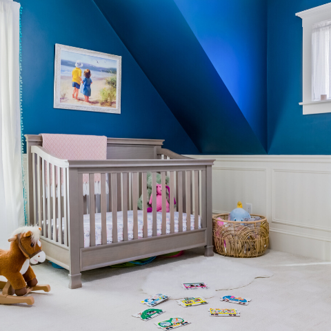
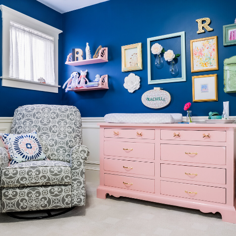
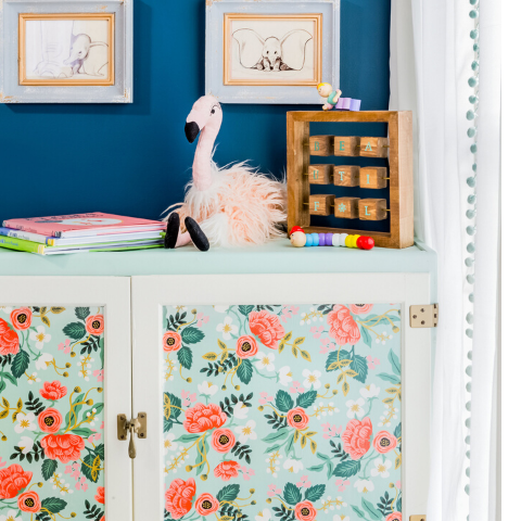
This nursery does't have a standout theme like the two previous rooms - and that is absolutely fine. The theme in this nursery lies within the color scheme.
Style: feminine, classic
Colors: navy blue, pink, mint
Specific: none
Design by: Boo & Rook
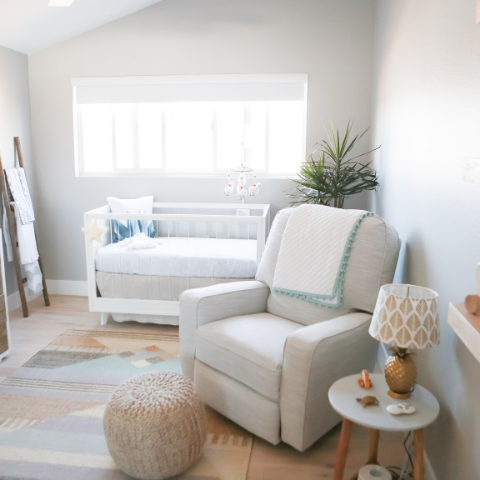
4. Neutral California Beach Nursery
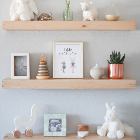
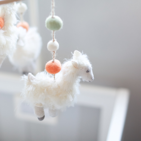
This nursery also does't have a standout theme like the two kids rooms. My client lives in California and wanted a gender neutral nursery that was minimal, clean and not fussy. For personal reasons she wanted to incorporate the beach and pineapples, and was really crushing on llamas at the time. In order to maintain the style she wanted, we thoughtfully placed 1-2 items from each of the three specifics she wanted throughout the nursery. That way, the three don't compete with one another and they stay personal to her.
Style: modern, minimal, coastal
Colors: neutral (white, cream, grey)
Specific: minimal (beach, llama, pineapple)
Design by: Boo & Rook
5. Stripes All Around Boys Room
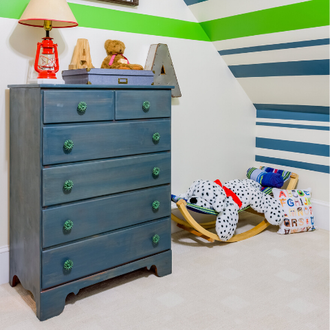
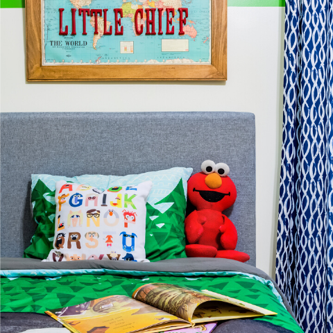
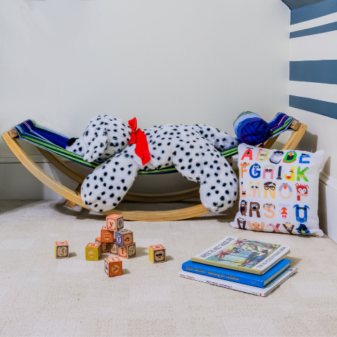
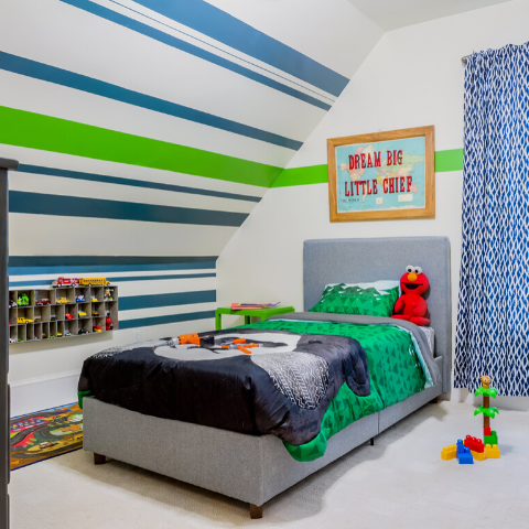
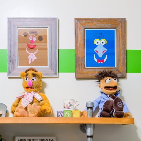
This is my son's nursery turned big kids room (he's about ready for another upgrade). Going into this design I knew we were going to do some DIY and refinish a dresser that has been passed down from my Uncles and is a solid classic piece. I chose stripes for a feature wall and taped them out in different widths, with one continuing around the room. My husband really wanted muppets so my sister (a graphic designer) created some minimalistic images and we also added a pillow and a few stuffed muppets. Once we were ready to switch his room, we swapped out those items for super heroes, and now modern animal art.
Style: vintage, industrial, classic
Colors: white, blue, green
Specific: muppets
Design by: Boo & Rook
I hope these examples helped you understand how you can design a child's space with a theme in mind and have it still grow with your child. If you have any questions, send me an email at design@booandrook.com and lets talk.
with grace & gumption,
Corinne
Products
View all